
A “Rat” Every 14 Seconds: Analyzing NYC 311 Calls
Try HeavyIQ Conversational Analytics on 400 million tweets
Download HEAVY.AI Free, a full-featured version available for use at no cost.
GET FREE LICENSEI recently joined the OmniSci team as a Developer Advocate and part of my job is to show people how cool OmniSci is. For my first project, I was told to play around with Immerse and write about my experience, and I couldn’t wait to dive in. The Tweetmap Demo is initially what attracted me to OmniSci. After that, I stumbled upon the NBA shooting data demo and after seeing years of interactive NBA data at my fingertips, I was hooked. Coming from a background in mathematics, data visualization has always held a special place in my heart. Now, I can get paid to tell stories about massive datasets that I find interesting? Sign me up!
Getting Started with OmniSci Immerse is Easy
My first step was to pick a dataset I wanted to work with. There were a lot of factors to consider. What kind of data do I want to work with: Sports? Traffic? Health? Politics? Well, I’ll just avoid that last one for now…
One question that I hadn’t considered before this project was where could I find massive datasets? There’s a wealth of free data available, but to truly harness the power of OmniSci’s platform, it makes the most sense to pick a very large set of data. Well, after doing a lot of research, it turns out that there is a multitude of easily accessible sources spanning a wide range of topics. Once I picked a topic, I had to then determine what kind of story I wanted to tell. Do I just play around and see what the data unveils? I’ve never had access to such large datasets while simultaneously having the ability to instantly visualize millions and millions of rows. I honestly didn’t know what to expect or what I would find.
Choosing the Right Dataset
After downloading and importing over 20 different datasets, I decided to dig into a dataset detailing 311 service request calls in the greatest city in the world - New York City. The city has been researched and analyzed as much as any, but it turns out there’s still all sorts of cool information available—if you have the tools to dig.
The NYC 311 Service Calls dataset has over 20 million geolocated incidents, including the nature of the complaint and the agency that responded to it. With the data going back to 2010, that’s an average of 1 complaint every 14 seconds.
New York is known for a lot of things— skyscrapers, delicious pizza and unfortunately a booming rat problem (since 2010, nearly 250,000 vermin complaints have been logged). Well, it turns out that there is more than one kind of "rat" taking place in the Big Apple. Of the 20 million Service Requests that have been made over the past 9 years, a decent percentage of the calls were related to noise complaints—New Yorkers “ratting” on other New Yorkers having a good time!
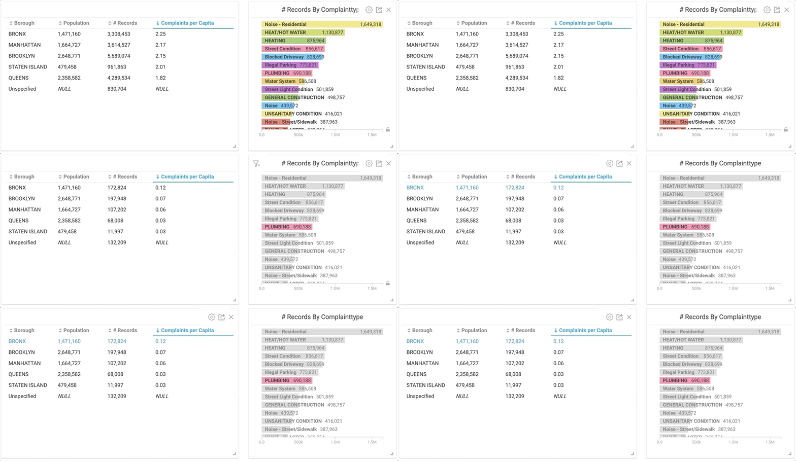
By clicking the “Plumbing” category in the right bar chart, the table on the left instantly changes to only plumbing related service calls.
Would you have guessed that The Bronx had the highest rate of complaints on plumbing by almost double the next closest borough? I don’t really know what it means, but it’s interesting nonetheless. But let’s back up a second... before I was able to spend hours manipulating the data, I had to import it.
Importing the NYC 311 Service Calls Dataset into OmniSci
One quick observation is that OmniSci Immerse makes it incredibly easy to import CSV files from your local machine. After downloading the dataset, you drag-and-drop it into the Immerse Data Importer and voila! Automagically, all of the data gets uploaded, with Immerse even picking the column names and corresponding data types.
Now, this process worked great when my datasets were a few thousand rows and only a couple MB’s big. Turns out that when datasets have 20 million+ rows, the CSV file can get pretty large. In my case, the NYC 311 Service Calls dataset is over 11GB. Uploading a file that large in the browser was going to take about 30 minutes. So I researched other options. As shared in the docs, the Data Importer accepts a variety of file types, including compressed files.
Protip: Importing a 1GB zipped CSV file is MUCH faster than uploading in the browser.
The 5 W’s (Who, What, When, Where, Why)... Kind of
Now that I had my data imported into Omnisci Immerse, it was time to make use of my digital data playground to find out which borough complains the most. Preliminary factors included:
- Who’s making the complaints?
- What are they complaining about?
- When are the complaints most occuring?
- How long do they take to resolve?
As a recently imported Manhattan-ite, I felt compelled to show that we’re different from those so-called hipsters all the way out in Brooklyn. Using OmniSci Immerse, I was able to easily show complaints by borough. I created a simple pie chart by clicking “Add chart,” selecting my data source, and setting the Dimension to “Borough” and the Measure to “# of records.” Almost instantly, Immerse aggregated over 20 million rows of data into a pie chart to reveal that Brooklyn does indeed have more complaints.
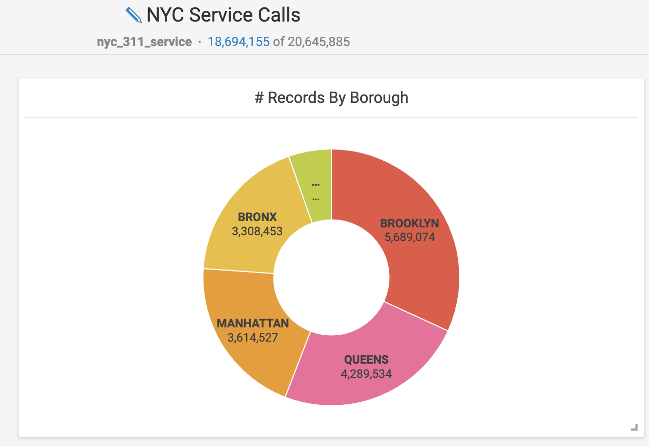
This is the total number of service calls made by each borough. Staten Island is the smallest and unlabeled section.
This doesn’t really tell the whole story, however. For instance, Brooklyn and Queens both have more people than Manhattan does. In order to see the per capita complaints by borough, I whipped up some custom SQL editing.
This was a bit of a challenge for me because, prior to this project, my SQL experience was somewhere between limited and non-existent. My first step was to create a column that had the population of each borough. I hardcoded these values using CASE statements filtering on the “Borough” field.

This is the custom SQL query I created that hard codes the population of each borough for the table.
Next, I got a hard lesson when I realized that even though I created a Population column, I couldn’t reference it in another custom SQL query. Since it was a synthetic column and not actually part of my table, I’d have to get more creative to get a “Complaints per Capita” field. A co-worker aptly summed up my early experiences, saying, “As you’re finding out, working with columns that aren’t concrete columns in the table is swimming upstream.” Welcome to SQL!
After that, I was able to create a “Complaints per Capita” column using another custom SQL query which made use of the previously hard-coded logic. Since every single row had this new Population field, I had to take the average of all of these rows organized by borough. Essentially, this meant taking the average of the same number over and over - a clever way of allowing me to use the population values to find the per capita complaints.
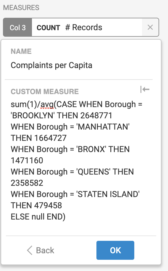
This is another custom SQL query that finds the number of complaints per capita.
So, Who’s Doing All of the Complaining?
From the initial pie chart, it was easy to see that Brooklyn logged the most calls. But looking a bit closer, you can see that the Bronx actually has a higher number of calls per capita. Manhattan and Brooklyn were very close at 2.17 and 2.15 calls per capita, respectively. (Just for fun, let’s just assume that a hefty chunk of the unspecified complaints took place in Brooklyn.) Queens has significantly fewer calls per capita than any other borough in NYC, based on the NYC 311 Service Call dataset.
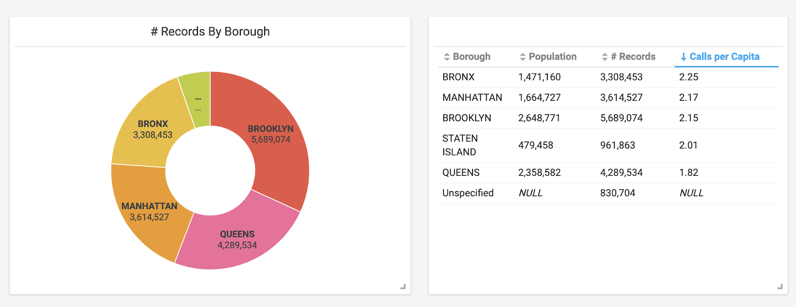
Using custom SQL queries, a table (right) was created that incorporates data from the pie chart and also includes population related columns.
With my first question answered, I wanted to consider other measurements and chart types to understand what’s prompting the 311 Service calls in NYC. Let’s look at what the calls were about.
No Wonder the City Never Sleeps, it’s Too Noisy!
Now let’s look at what the calls were about. To do this, I made a simple bar chart and organized it by using “ComplaintType” for the Dimension and “# of Records” for the Measure. This gave me a great snapshot of the types of calls being made.
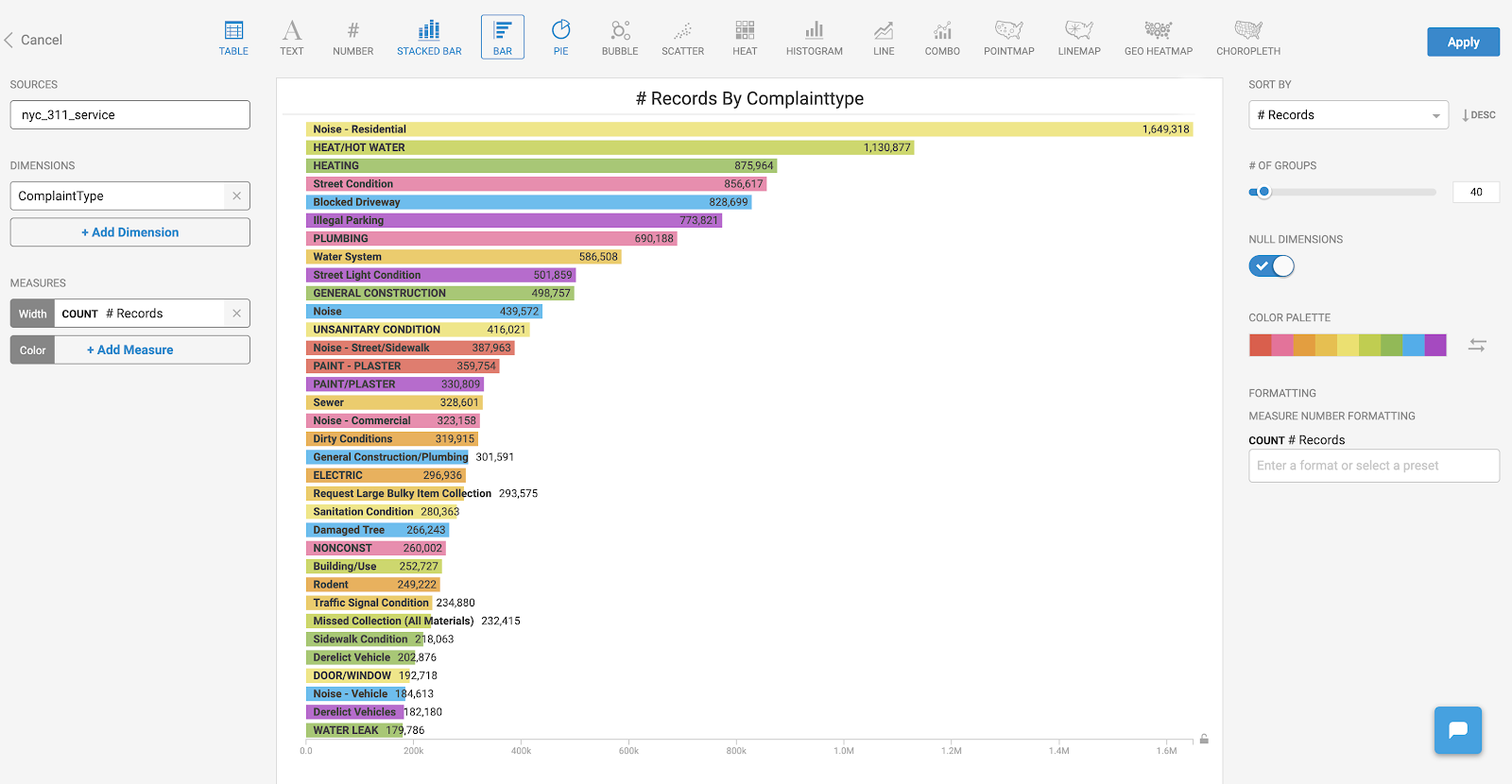
A simple bar chart showing the most common types of service calls.
As you can see, an overwhelming amount of calls across all boroughs were related to residential noise complaints. To be fair, the data isn’t necessarily categorized in a standardized manner. For example, the next top categories, “Heat/Hot water” and “Heating” seem to be related. I don’t know definitively how one is categorized as compared to the other, but I would guess there’s likely overlap between the two. In a similar vein, there are several noise related categories, including a very generic category simply called “Noise.” I imagine a percentage of these could also have been attributed to the “Noise - Residential” category.
One of the most amazing things about OmniSci Immerse is the ability to dig into a specific subset of data and be able to instantly cross filter all the other charts that you’ve added to your dashboard. This is made possible by harnessing the power of OmniSci Core along with GPUs to perform multiple SQL queries extremely fast.
I was curious and wanted to see more information about these noise complaints. The GIF below demonstrates what happened when I clicked on “Noise - Residential” in the bar chart. Notice how my pie chart and table are instantly updated using this new subset of data.

By clicking the “Noise” category in the bar chart, the charts instantly populate with the corresponding information thanks to cross-filtering.
Bored? Call 311!
Finding out when people called 311 ended up being the most interesting category for me. By creating a heatmap based on the created date/time of each complaint, I was able to get an instant snapshot of when calls were being made.
To create this, I set up one Dimension of the chart to be the ‘created date’ and used the “bin” feature to group it into days of the week. For the other Dimension, I again used the “bin” feature on the ‘created date,’ but this time grouped it by months. If you’re reproducing these results, I would recommend this section of the OmniSci docs, where you’ll find information on all of the chart types available in Omnisci. (And they’re usually fun too!)
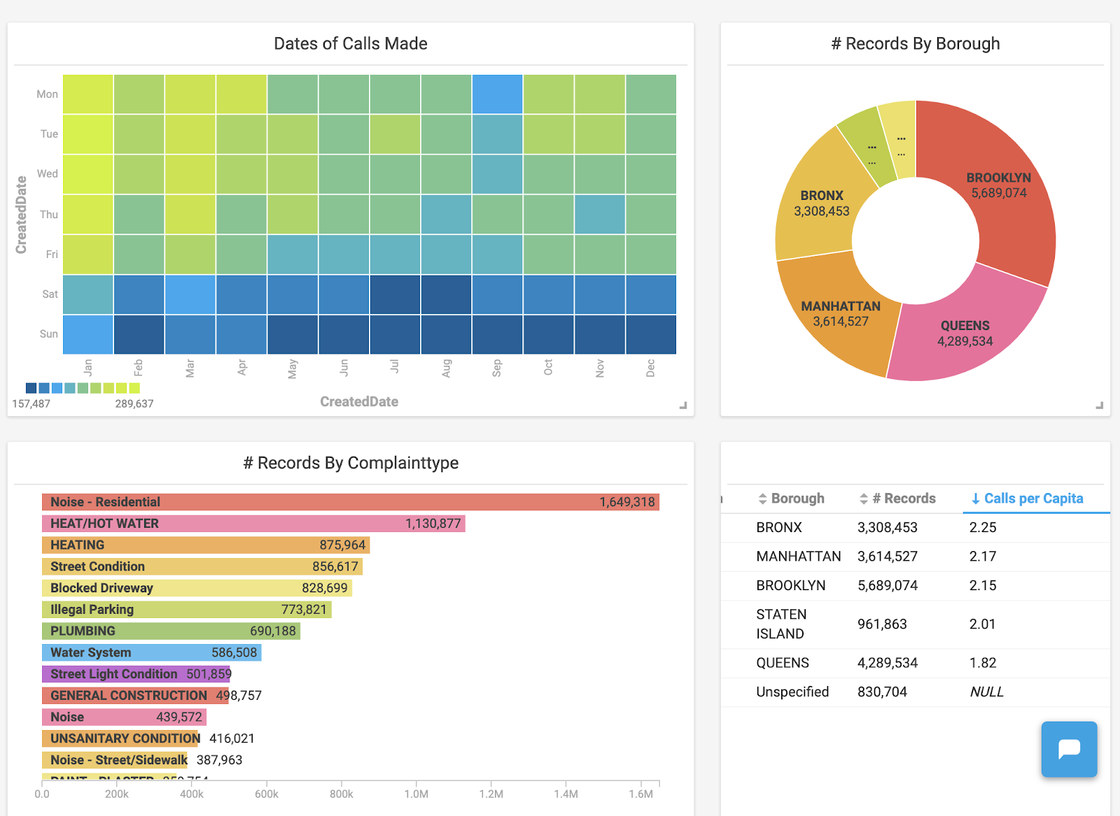
An Immerse dashboard now including a heatmap alongside other chart types.
Once the heatmap was created, two things immediately jumped out to me:
- An overwhelming amount of calls were made in January and March compared to other months.
- The number of calls were significantly lower during the weekends.
Let’s unpack these and see what’s going on. From this limited dataset, it appears that when people are stuck inside, they’re more likely to call 311. Using the power of Immerse, I was able to click the boxes that I wanted to look at in the heatmap and have it cross-filter that data into the other charts I already had available in my dashboard. By clicking these boxes, I observed that the majority of the complaints in January were heating related.
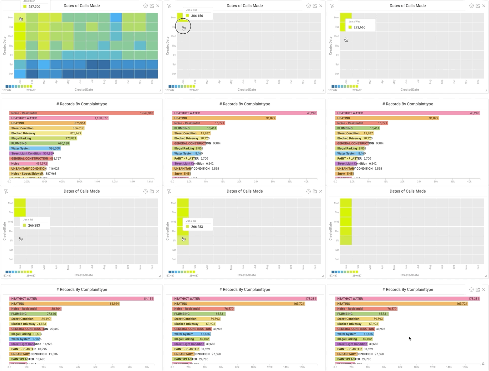
Clicking specific areas of the heatmap instantly shows the most common complaint type for a given time.
These trends held true for the other winter months as well. February has the lowest gross number of calls, but only because there are fewer days. When normalized, the call rate in February is the same.
Next, I wanted to see what was going on during the weekends. I chose the weekend days on the heatmap and looked at the corresponding charts. Unsurprisingly, noise complaints jumped through the roof.

Similar to the GIF above, all weekend days are selected on the heat map to show the most common complaint types during those times.
I discovered another quirk around the time that 311 calls are generally made by simply playing around with the data. I created a second heat map that looked at the time of day that complaints were made. Filtering the data to look at graffiti-related complaints revealed the picture below. Graffiti calls spiked on weekdays at 1pm and 6pm. Are graffiti enthusiasts your typical 9-5ers who get their paint fix on their lunch break or right after work? I don’t know, but the data would certainly support that theory.
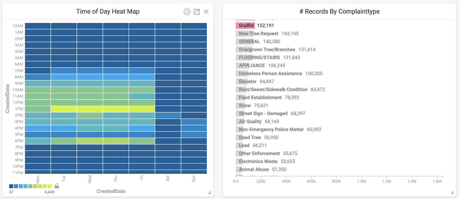
Here, a specific complaint type is selected and observed on the corresponding heatmap.
Winter is Coming, but are the Repairmen?
With all this data available, I wanted to see how long it took issues to be resolved. Were there more pressing issues that generally got fixed faster than others? These are the types of questions I was looking to answer. Using another custom SQL function, I set up a “# of days passed” histogram and immediately saw that a majority of complaints are handled very quickly. In fact, over 50% of all the complaints were handled within three days.
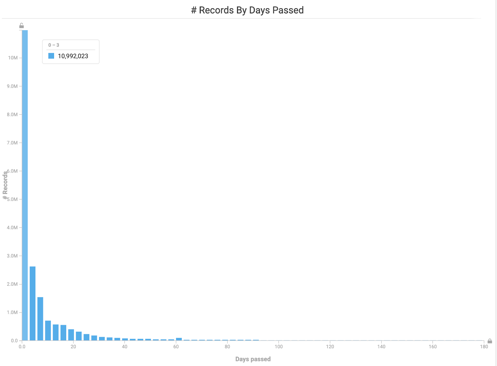
Histogram showing how long it took for complaints to be resolved.
What happens with pressing complains, such as having no heat in the frigid winter months? Let’s see if those types of issues were resolved quickly.
By selecting the winter months on our heatmap and the heating related categories in our bar chart, I was relieved to find that a large majority of these issues were solved in a timely manner. In the picture below, you can see that almost all of the heating-related complaints have been resolved in less than a week.

Closing Thoughts on Getting Started with OmniSci Immerse
This was an incredibly enjoyable and enlightening first project. The ability to process and visualize such large datasets in near real-time provides endless opportunity. I highly recommend finding a dataset that you’re interested in, loading it into Immerse with our 14-day free trial of OmniSci Cloud, and discovering the power of GPU-accelerated analytics for yourself. But be careful - make sure you have a few hours to spend!


