
Big Data Analytics for Oil and Gas with HEAVY.AI Visual Apps
Try HeavyIQ Conversational Analytics on 400 million tweets
Download HEAVY.AI Free, a full-featured version available for use at no cost.
GET FREE LICENSEAbout Energy Market Data Analysis
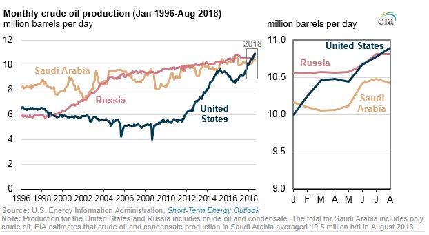
There are many reasons why analyzing energy market data is more difficult, and more important in today’s global economy than in the past. In the US, we have gone from being a net consumer of oil and gas to the largest producer in the world.
Crude Production Trends
Natural Gas Production Trends

This change is accompanied by many changes in world-wide logistics and distribution of Energy. The developing countries are on the fast track to Electrifying their populations with globally sourced oil and gas products and renewable energy.
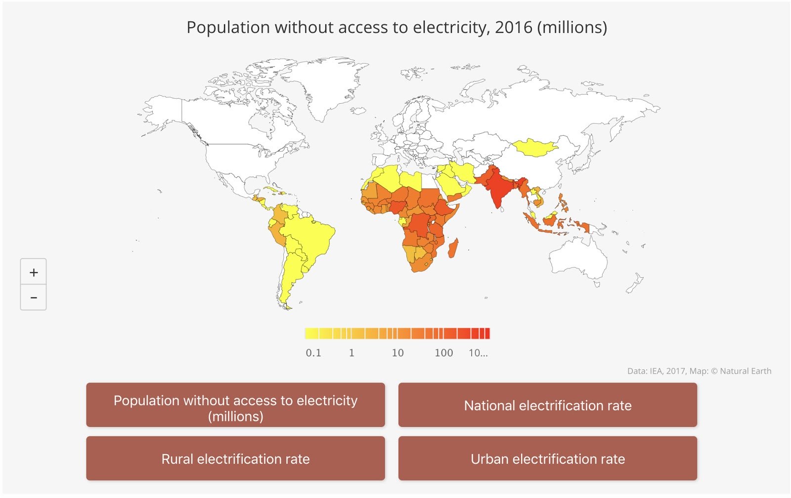
These trends, new US production and the globalization of energy distribution and consumption, have created an increased need for companies and governments to analyze large, complex amounts of data in order to optimize corporate plans and national policy to meet the needs of the future - see How Energy Business Intelligence Informs Investment. Additionally, there is an ever increasing need to measure and analyze carbon emission data related to these markets.
Below is an overview of the types of data used in energy market analysis:
- Technical Analysis:Similar to Stock Market Analysis. Time Series in nature (some Geospatial)
- Futures Price Data (Daily and Intraday ‘tick’)
- Volatility, Interest Rates, Exchange Rates, Options Prices and Related ‘Greeks’
- Over the Counter Swap information (same attributes as above without the ‘tick’ data)
- Physical (Assessed) Prices
- Operational Analysis:Geospatial and Time-Series in nature
- Production Data (Oil and Gas Wells)
- Logistics Data (pipelines, railway, processing plants, refineries, vessels)
- Power Generation and Distribution: power plant fuel consumption, power output
- Geopolitical: National and International policy
The nature of the data requires the ability to analyze and visualize large amounts of this daily, monthly, and annual time-series data in a geo-spatial context. With most traditional technology approaches, we must choose between analyzing large data-sets without robust visualization or using incomplete subsets of data in order to get rich visualizations. With OmniSci, a pioneer in GPU-accelerated analytics, we can analyze and visualize the Oil & Gas spatiotemporal datasets without compromising along these dimensions. Omnisci is an excellent platform for ingesting, analyzing and visualizing this data in its entirety without the need for any pre-aggregation or indexing.
Analyzing US Natural Gas Flows
US Natural Distribution SystemNatural Gas Production in the United States consists of a series of Processing Plants to extract Methane (Natural Gas) from well production. Once the Natural Gas is extracted, it is injected into the pipelines to be shipped to market centers, power plants, local utilities, etc.
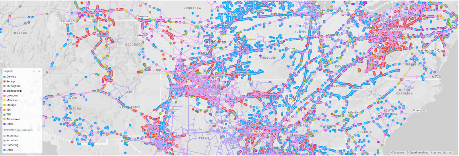
As you can see from the OmniSci Linemap rendering below, natural gas is transported using an interstate pipeline network. The natural gas is transported from the producing regions using pipelines at high pressure which helps to reduce the volume by almost 600 times and propels it to its destination.
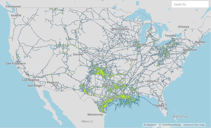
US Natural Gas Pipeline Network - Rendered on OmniSci Map
Initial Market Data Analysis Case - Natural Gas Pipeline Flow Data
All Intrastate Natural Gas Pipelines in the US are required by Federal Energy Regulatory Commission (FERC) to report their metered flows through their pipelines at least 5 times/day. This information can be scraped from the websites and cleaned for analysis of the flow and market implications related to flow.
There are roughly 42,000 meter points published daily by pipelines in the in the US. Flow through each meter is generated at least 5 times per day.
About the Dataset
The gas production dataset consists of meta data and production data sets which are joined for analysis and visualization in OmniSci. Below is a description of the data.
Flow Data Description
Field
Type
Description
Example
ReportedDate
TIMESTAMP(0)/p>
Date Reported to Market
1/10/2019
FlowDate
TIMESTAMP(0)
Date of Pipeline Flow
1/9/2019
MeterID
STR[dict. encode]
Unique ID of flow meter
ALAT0003
Volume
FLOAT
Gas flow amount
0.2
Category
STR[dict. encode]
Receipt, Delivery, Power Gen, etc
0.96000
Meta Data Description
Field
Type
Description
Example
MeterID
STR[dict. encode]
Unique ID of flow meter
ALAT0003
PointName
STR
Sabine
1/9/2019
PointType
STR[dict. encode]
Power
ALAT0003
State
STR [dict. encode]
State for meter location
Louisianna
Country
STR[dict. encode]
Country for meter location
Lafourche
Pipeline
STR[dict. encode]
SPipeline Name
Sabine Pipeline
PointIsActive
STR[dict. encode]
Pipeline activity status
Yes
DesignCapacity
FLOAT
Pipeline flow capacity
0.98
FlowDirection
STR[dict. encode]
Flow direction (N/S/E/W)
South
DisplayName
STR
Description of meter
Delivery
Latitude
FLOAT
Latitude
30.188357
Longitude
FLOAT
Longitude
-93.694936
* Data is joined on MeterID and MetaMeterID
In this blog, we will show how we used OmniSci’s charting library to create multi-layered point & line map along with bar and time charts using the natural gas production dataset.
Read the gas production data and meta data from the CSV files into their respective Pandas DataFrames:
df_meta = pd.read_csv("meter_metadata.csv")
df_measure = pd.read_csv("meter_measure.csv")
The production metadata has a column named meter_metaID which is a unique id for the natural gas production point issued by the Petroleum Institute. Each production data record also carries a column named meterID which is the same. We merge the two dataframes using these columns:
df = pd.merge(df_measure, df_meta, left_on=meterID, right_on=meter_metaID, how='inner')
And finally save the merged dataframe to a CSV file:
df.to_csv('./meter_measure_with_meta.csv', index=False)
Bulk Insert Data
We chose OmniSci Cloud platform for developing our application which is the fastest way to start using the platform. You can sign up for a cloud account, and get immediate access to an instance of OmniSci running on GPU in a public cloud.
The generated CSV file with the detailed gas production data for a 4 month period has 117 million rows and 22 columns. This is a fairly large file at 26 GB uncompressed, and using OmniSci’s bulk insert COPY FROM method would be the most performant way to load the data into the database table. Here are the steps to create the table and load the data into an OmniSci Cloud instance:
- Get the first 100 rows from the CSV file and save it as smaller CSV file. $ head -100 meter_measure_with_meta.csv > meter_measure_with_meta_small.csv
- Using the DATA MANAGER -> Import -> Local File option on Immerse load the smaller CSV file.
- Make sure that the table is created correctly where all the columns data types are identified correctly.
- Using Immerse SQL EDITOR truncate the table so that we have an empty table with the correct DDL: sql> truncate table
- Gzip the large CSV file, the 26 GB file compressed to 500 MB!
- Copy the gzip’d CSV to a AWS S3 bucket.
- Using Immerse SQL EDITOR append data to the empty table from S3: sql> COPYFROM ‘s3://mybucketname/meter_measure_with_meta.csv.gz’
Confirm that the data is loaded correctly by creating some sample charts using Immerse DASHBOARD. As you gather more data, you can establish a workflow by copying the CSV file to S3 and then executing the COPY FROM command to append to the existing table.
OmniSci Charting
OmniSci provides mapd-charting - a superfast charting library that is based on dc.js, and is designed to work with MapD-Connector and MapD-Crossfilter to create charts instantly using OmniSci's Core SQL Database as the backend. If you are curious about the MapD prefix, you can learn more about the rebrand from MapD to OmniSci. In mapd-charting, you will find sample code for creating frontend rendered charts like Bar, Line and Scatterplot. The sample code also shows how you can create backend rendered charts like Point, Line and Poly Maps in multiple layers using OmniSci's powerful GPU-based engine.
Install mapd-charting
Get the source code:
\git clone https://github.com/omnisci/mapd-charting.git
Install Dependencies:
cd mapd-charting
yarn install
Test a simple cross-filtered chart example:
cp example/example1.html example/index.html
yarn run start
Open a browser to http://localhost:8080, and you should see three cross-filtered charts that use the sample flights dataset.
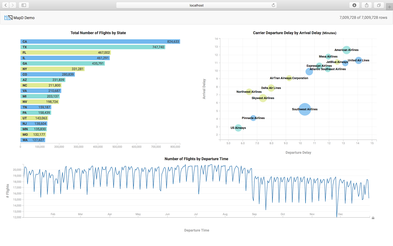
The function init() in example1.html shows how to connect to the OmniSci backend database, here it is connecting to the host metis.mapd.com which is a OmniSci server open to the public.
Testing mapd-charting with your Cloud instance
To test the charting API with your OmniSci cloud instance, use the following init() function that will work with the standard cloud instance using the preloaded flights_2008_7M table. You will need to set the user and password variables by creating the write API key under the Developer tab in the Cloud Settings interface as shown in the caption below.
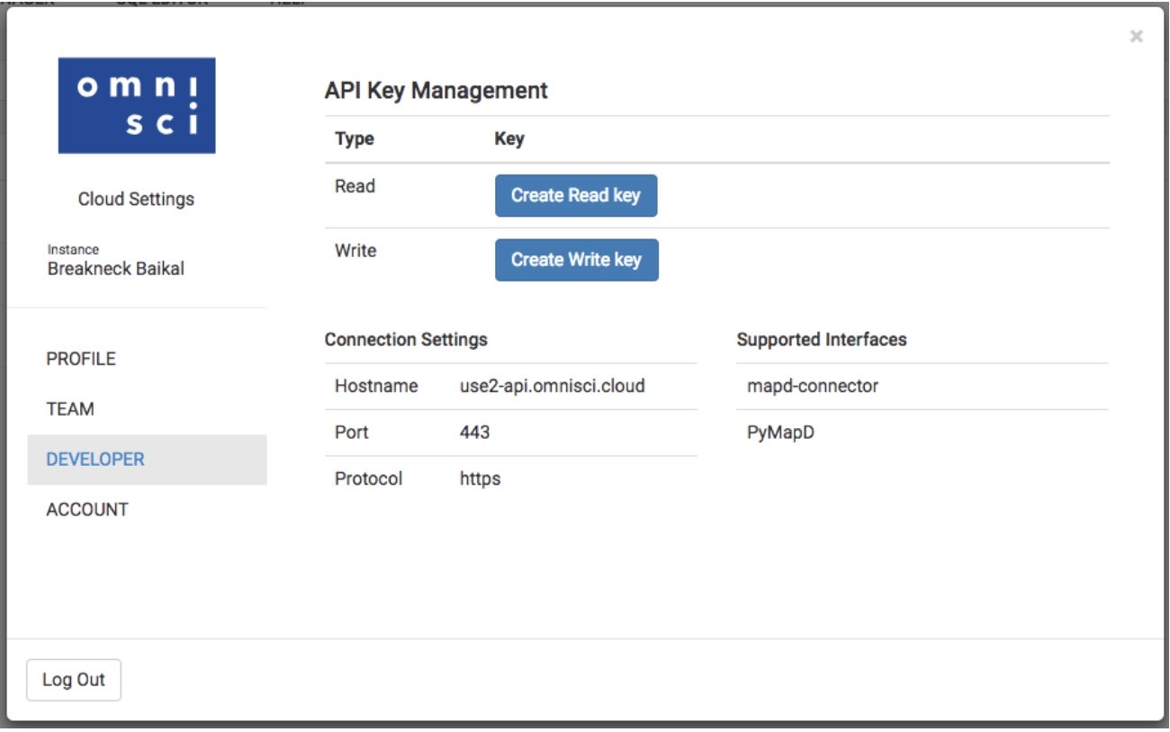
function init() {
/* Before doing anything we must set up a mapd connection, specifying
* username, password, host, port, and database name */
new MapdCon()
.protocol("https")
.host("use2-api.mapd.cloud") // Connect to OmniSci Cloud Host
.port("443")
.dbName("mapd") // Default database
.user("API Key Name from cloud instance SETTINGS")
.password("API Key Secret from cloud instance SETTINGS")
.connect(function(error, con) {
/*
* This instantiates a new crossfilter.
* Pass in mapdcon as the first argument to crossfilter, then the
* table name, then a label for the data (unused in this example).
*
* to see all availables -- con.getTables()
*/
crossfilter.crossfilter(con, "flights_2008_7M").then(createCharts)
/*
* Pass instance of crossfilter into our reateCharts.
*/
});
}
The three charts (bar, bubble and timeline) use the columns (dest_state, carrier_name, depdelay, arrdelay, dep_timestamp) from the flights_2008_7M table. You can apply filters by clicking on a particular state on the bar chart, or selecting an airline on the scatter plot or dragging the time brush on the time chart. You will notice that all the charts will automatically redraw, applying the selected filters using the crossfilter functions.
Oil & Gas Custom App
For monitoring the natural gas production in the US we will create a custom Javascript application based on mapd-charting. In this custom analytics tool, we want to see the different natural gas measuring points, the gas flow over time and the gas flow based on the US region. As the US Natural Gas Pipeline information is available from the department of energy we can layer that on top of the gas production points. The pipeline information is available as ESRI Shapefile and we can import it into OmniSci using Immerse -> DATA MANAGER -> Import option. The pipelines are represented as LINESTRING which is imported as the omnisci_geo column. The sample code in exampleMultiLayerMap. shows how to create a backend rendered map widget with multiple layers using pointmaps. The sample code in exampleLinemap.html shows how to create a backend rendered geo linemap. For further documentation you can refer to Dimensional Charting (dc.js) .
The Pointmap is rendered using the Longitude and Latitude columns from the gas production table where the size of the point is based on the flow_value and the points are colored based on the FlowDirection (Delivery, Receipt, Throughput, etc.). The Linemap is rendered using the omnisci_geo (LINESTRING) column from the US pipeline table, and the lines are colored based on the TYPEPIPE column.
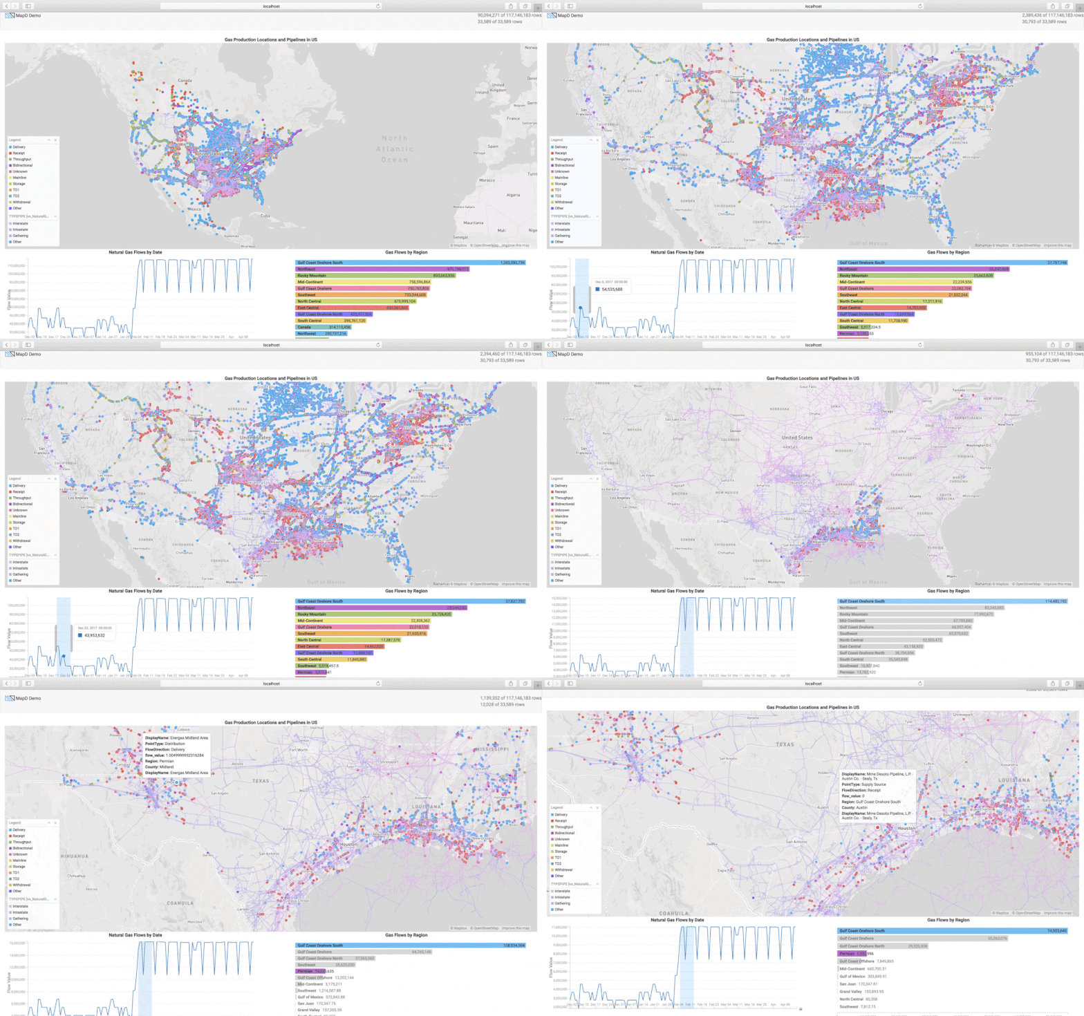
The sample code in example1.html shows how to render bar and time charts, and also shows how to use the crossfilter API. Refer to Crossfilter API Reference for more details. We create the time chart with the flow_date on the x-axis and the SUM of flow_value on the y-axis. The bar chart is created using the Region column and the width of the bar represents the SUM of the flow_value. You can check out my code and customize it for your application.
Conclusion
At i2 Enabled, Inc. we have a Natural Gas production monitoring and visual analytics platform that provides different visualizations for time-series data. By incorporating OmniSci Core database we can scale the amount of data by extending to multiple Geos and for longer time periods. At the same time by using the OmniSci Render we can also visualize the SQL query results in milliseconds and present the charts alongside our existing application. User workflow for query and visualization is reduced from minutes with alternative platforms, to immediate analysis and visualization using the OmniSci platform. If you want to see the application in action and meet us in person, stop by our session Using GPU-Powered Analytics to Unlock Data Value in the Oil and Gas Industry at the IBM Think 2019 in San Francisco.


