Applying Data to the Next Phase of the COVID-19 Pandemic
Try HeavyIQ Conversational Analytics on 400 million tweets
Download HEAVY.AI Free, a full-featured version available for use at no cost.
GET FREE LICENSEIn just a few short months the COVID-19 pandemic has upended the world. In the short term, national and regional responses have included containment through quarantine and restriction of movement. Properly implemented, these solutions aim to limit spread of the contagion as to not overwhelm the strained resources and capacity of our global healthcare and emergency management systems. Given the severe economic side effects of these measures, however, authorities around the world are already planning relaxing restrictions on movement in anticipation of declining spread.
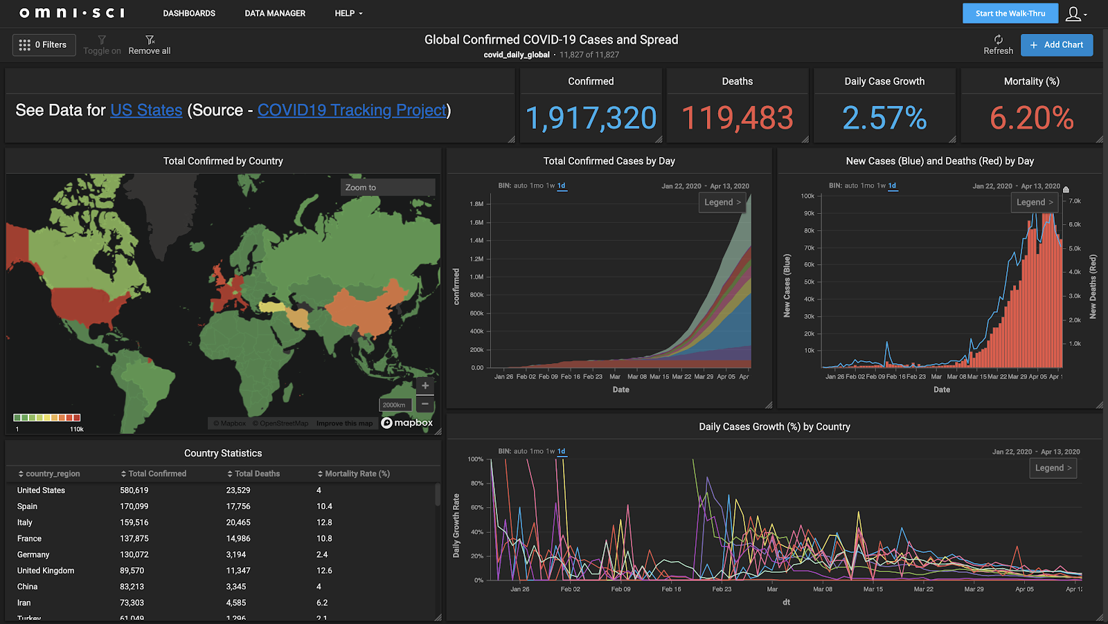
Data and analytics have played a central role in the first wave of the global response. From the earliest days of the pandemic, we’ve had up-to-date reports of case counts, fatalities and recoveries gathered by industrious volunteers everywhere. JHU’s CSSE created the popular dashboard that curates this data from a myriad of sources throughout the globe. Worldometer has an up-to-date case infection count, and several other sources have sprung up with similar information. Commercial organizations, including OmniSci, have made available both tools and data to help inform the public.
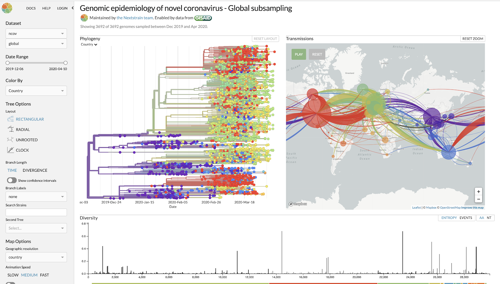
In addition, there are deeper, data-driven investigations into the phylogeny of the virus itself - nexstrain has an up-to-date summary of the different strains so far, self-reported by virologists worldwide.
Yet even after this first global outbreak has been contained, a sustained response is required to fight COVID-19, and will continue to place an enormous burden on local and regional authorities. Seasonal peaks or regional outbreaks, for example, could necessitate a return to movement restrictions as quickly as they emerge. How long such restrictions remain in place is equally important - and this needs to be calibrated against repeated shocks to the economy.
This results in a number of related needs on the data and analytics front. At OmniSci, we’ve worked with a number of partners, including SafeGraph, Veraset and AWS, to bring together relevant data to address these needs: combining partner datasets that include anonymized cell phone location data from our partners, and publicly available geographic datasets on administrative boundaries and demographic information. Our goal is to provide a multi-perspective tool to federal and local authorities and policy-makers to aid in the continuing fight against COVID-19. This covers several areas, of which we’ll illustrate three below:
Interactive, population-scale contact tracing capabilities
First, contact tracing has emerged as a data-driven method to identify and contain the transmission of COVID-19 (and other diseases). Contact tracing fundamentally involves tracking the movement and interactions of infected individuals to identify others at risk. The Singaporean government built an app to encourage people to opt-in to tracing, and in the United States, Apple and Google took the unprecedented step of working together on a solution that would protect people’s health and privacy at the same time. But no matter the technology used for collecting the tracing data, at nearly two million global infections (at the time of this writing), with an estimated R0 of between 2-3, using that data to contain the spread is a daunting task.
As a first step, authorities need granular and comprehensive contact tracing capabilities, ideally at the level of local and regional populations where they are best positioned to take immediate action. However, they also need to consider travel patterns which require them to particularly focus on major entry points such as ports, airports and border areas. Of particular importance here is the need to go from higher-level aggregate patterns or trends surfaced in the data, to lower-level patterns of life as quickly as possible. The ability to identify and quarantine specific individuals (and their primary social units, i.e their families), as well as understand broader patterns of interaction will allow for movement restrictions to be more targeted and effective in the inevitable subsequent phases of the pandemic in 2020 and into next year.
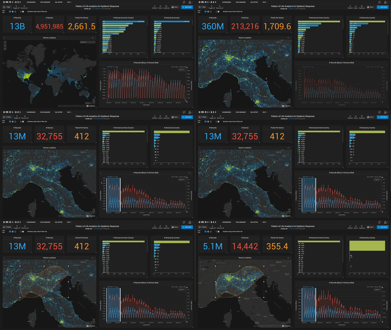
To illustrate this type of scalable contact tracing, we combined human movement data with spatiotemporal cohort analysis capabilities in OmniSci Immerse. We started with nearly 160 billion raw geolocated data points in a pattern-of-life dataset for over a month, covering about 5 million devices. We aggregated this by the anonymized device identifiers to compute dwell times in spatiotemporal bins, which allows us to observe granular patterns of life for specific devices and more importantly (for public authorities), different cohorts of devices. An example cohort might be ‘all devices that were observed at JFK airport at 5pm on March 5th’. Another might be ‘all devices observed in proximity of a hospital known to have a large influx of COVID-19 patients’. Once a cohort is identified, health authorities can monitor that cohort in a targeted way.
Below is an illustration of this analytical workflow:
Monitoring the effectiveness of movement restrictions
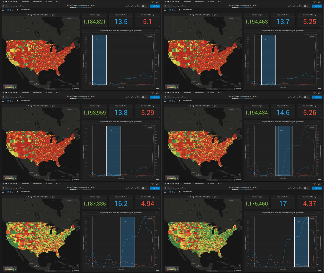
Mandatory and voluntary social distancing has proven effective so far, but it’s also clear that any number of underlying factors could cause this effectiveness to vary along geographic and temporal dimensions. To begin with, authorities need to quickly understand whether local and regional decrees on quarantines and social distancing are indeed effective, and take actions accordingly. For example, a simple guiding measure may be - what proportion of a population in an area of interest (county or block group) actually traveled on average, more than a given distance beyond their home block group? How could this in turn, factor into the potential for spread (as measured by the population density and the baseline number of cases)? Are areas with lower ‘effective’ social distancing (such as cities) always at greater contagion risk? Conversely, are rural areas at reduced risk?
Answering these questions (and others) requires integrating demographic data with movement data, and being able to look at this data at multiple levels of geographic and temporal aggregation. Here is an example of how we integrated location information and computed additional statistics on dwell time, showing how the average time spent at home increases, and the average distance traveled decreases through most of the country as movement restrictions are put in place. You’ll notice that some regions have been slower than others to restrict movement, which might lead policymakers to prepare for a potentially more rapid spread of the virus in these areas.
Up-to-the-minute view of healthcare systems at every level
Finally, the overall status (and carrying capacity) of the healthcare system will be a major factor in the response, over any time horizon. It is beyond inspiring to see the heroics of the front line hospital workers. Especially when you consider some of them are seeing 10x the number of patients with a fraction of the usual staff because of the heartbreakingly high infection rate within healthcare workers. The system is being overwhelmed. To prevent this, authorities need to develop a detailed, updated picture combining logistical information as well as background data on public health, in addition to statistics about how COVID-19 itself is affecting public health at large - a great example in this regard is Kevin Systrom’s investigation on computing R0 in real-time
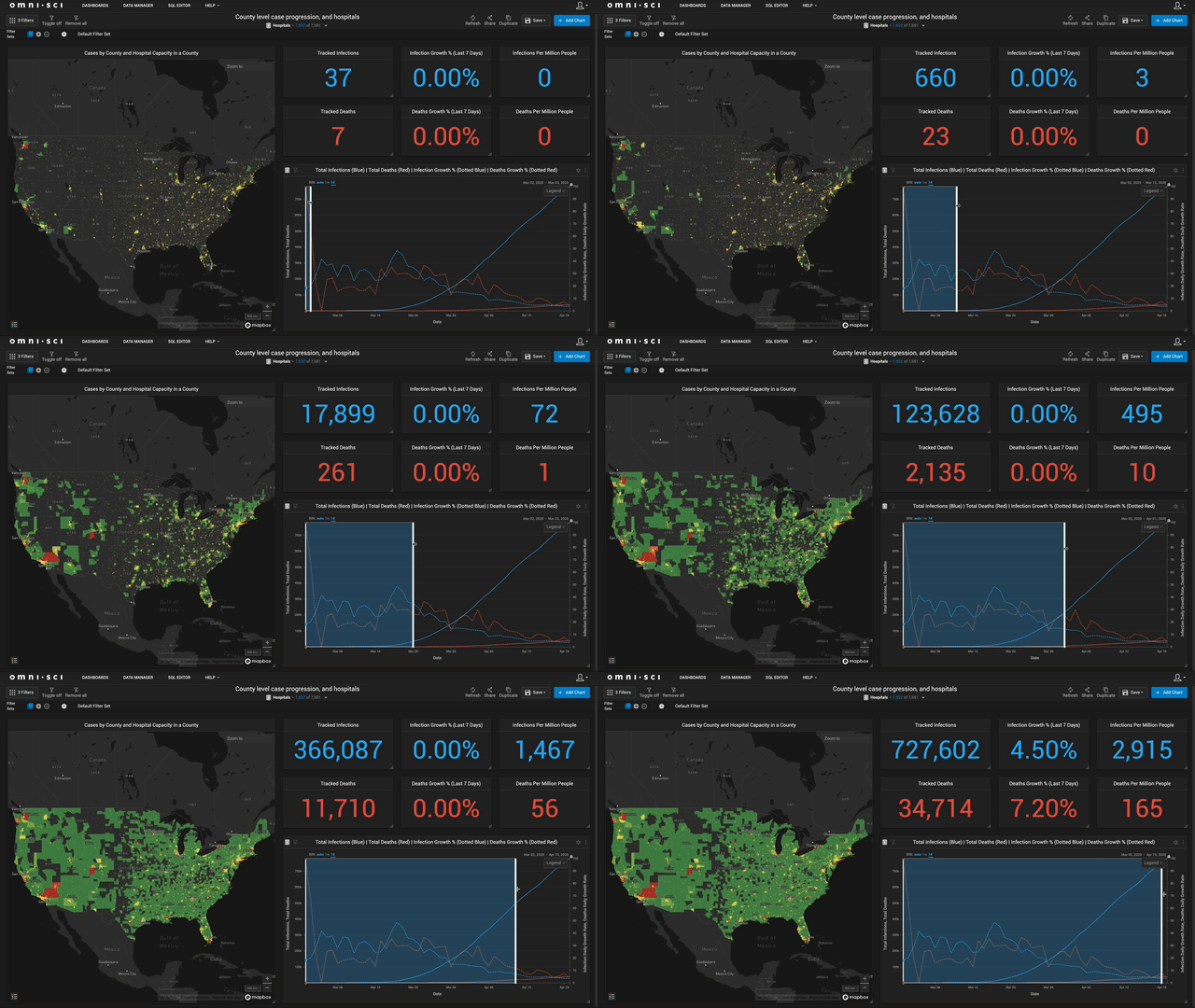
This involves integrating several data perspectives - logistical information about healthcare facilities is partially publicly available. So is historical data on the prevalence of chronic conditions (and their comorbidities with Acute Respiratory Distress Syndrome resulting from COVID-19) within local and regional populations, as well as related demographic data. Researchers have found evidence that both public health infrastructure and pre-existing population health characteristics are statistically-significant predictors of mortality. Mapping these risk factors, individually and jointly, should help in more efficiently allocating scarce resources. While we are still working on this, here is an illustration of how we have combined healthcare facility information with county-level confirmed case data from the New York Times
Looking ahead
A key caveat - we are not in any way attempting to substitute for the expertise and experience of policy makers and health experts. In discussion with government health officials to date, we have identified the above areas as ones that can particularly benefit from the creation of a unified collection of data and analytical perspectives to guide response in a timely and effective manner.
We will continue to devote resources and time to provide people on the frontline with data products that they can leverage. Looking ahead, we are focused on further building out robust and useful measures and analytics combining data science with public and partner data sources. If this is something you would like to help out with, feel free to reach out to us at covid@omnisci.com or join our community forum discussion.
Concluding thoughts
COVID-19 poses the biggest test yet for our capacity to apply the tools we’ve built in less stressful times, to an urgent ,rapidly evolving, and existentially important set of public health needs. OmniSci is committed to all we can do in this regard, but it is not something we can reasonably hope to do alone.
We first of all wish to thank our first responders and healthcare frontline workers - they are our soldiers in this fight, and will continue to be for the foreseeable future, and we owe it to them to make their work easier to the extent we can. Next, our growing list of new and long-standing partners for their willingness to contribute data, compute resources, and effort: SafeGraph, Veraset, xCures and Amazon Web Services
We look forward to all the possible ways we can help - if you’re interested or have questions, please contact us at covid@omnisci.com with suggestions or ideas, and join our community forum discussion.
In the meantime, please stay safe, and healthy!
Next time
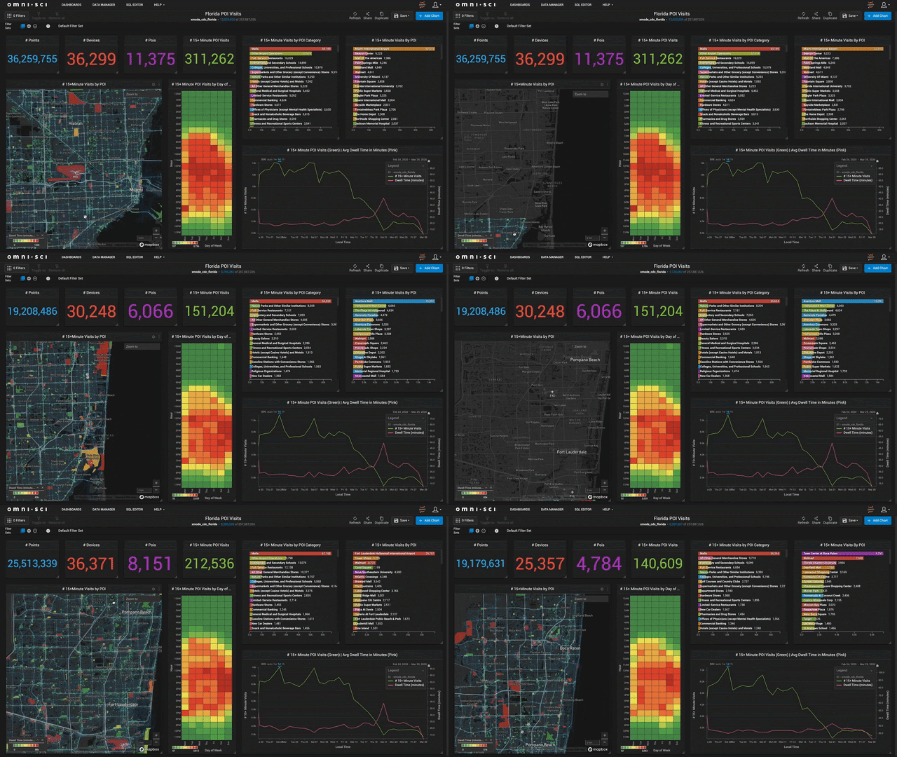
Stay tuned for our upcoming blog as we track 15+ minute visits to points of interest across Florida. This level of view is critical for researchers and policy makers as they make important decisions around which businesses and schools to open, and when and where.
