How to Explore NFL Data Interactively on OmniSci Cloud
Try HeavyIQ Conversational Analytics on 400 million tweets
Download HEAVY.AI Free, a full-featured version available for use at no cost.
GET FREE LICENSEIn mid-December, without much fanfare, the NFL launched their inaugural Big Data Bowl. The program was a first-of-its-kind sports analytics contest, with the NFL’s Football Operations group providing a big slice of their traditional and Next Gen Stats to the public. It challenged teams and individuals to use the NFL data to “rethink player performance, and to innovate the way football is played and coached.” This program was a very smart move on the NFL’s part, both as a showcase of the depth and quality of their data, and as a foundation for the community of data scientists who can understand it.
The formal Big Data Bowl contest ended January 25, but with the Super Bowl coming up this weekend, I wanted to share how I loaded this data into OmniSci Cloud and some simple insights I found while playing with it. Follow along and you too will be exploring the NFL data in no time.

Getting the Data
In the Big Data Bowl GitHub repo, you can find everything you need to get started, including the data itself. Unfortunately, the NFL removed some of the data files from the repo on January 25 when the contest was over, but we can branch off of a previous commit to get the data back. Here are the three commands you’ll need to get the repo with all of the data:
- Clone the repo git clone https://github.com/nfl-football-ops/Big-Data-Bowl.git
- Revert to the commit from December 23, before the data was removed cd Big-Data-Bowl git checkout -b my-data-exploration 0dac66c
Preparing the Data
Once you have the data on your local computer, the next step is to merge all of the source data files into a single table to get it ready for import to OmniSci. We want all of the data in a single table so that when we filter on one attribute in OmniSci Immerse, the filter will be automatically applied to all of the results. (More on what this looks like later when we look at the dashboard.) Also, OmniSci carefully manages the use of GPU memory, only loading columns from the table into memory as they are needed, which means there is no penalty for having a wide table.
The Jupyter Notebook I wrote walks through the three steps to process the data:
- Combine all of the individual tracking files for the games into a single dataframe, so all of the telemetry is together.
- Add the columns from the plays, games, and players tables into the same dataframe.
- Add three new columns: the team name of the player in each telemetry position (as opposed to home/away), the game clock from the start of the game (as opposed to the quarter), and a full timestamp column with the game clock and the date of the game.
Import into OmniSci
Once the data is flattened into a single CSV file, you’re ready to import it into OmniSci and start analyzing it. There are several ways to get OmniSci running, but by far the easiest is our SaaS: OmniSci Cloud. In about a minute, without having to give us any credit card information, you can have a full OmniSci instance running on GPUs. No need to bother spinning up and managing a GPU instance, we’ve made it easy.
No matter which path you take to get started with OmniSci, importing data is simple. Inside the OmniSci Immerse interface, click on the Data Manager tab, and then click the blue Import Data button in the upper right. On the next page, you’re given two choices for importing data: by uploading a file, or directly from S3. Choose the file option, and select the CSV file you generated in the first part of the post. Once you do, OmniSci will upload the file. Once that is complete, click the blue Preview button at the bottom right side of the page and OmniSci will give you a preview of the data. Give the table a name, and click the blue Import Table button to finish the import.
After the import is a success, you can click back on the Data Manager tab at the top and see that your new table is included. Now you’re ready to build a dashboard with the data and can begin analyzing it.
Create a Simple Dashboard
In the OmniSci Immerse interface, click on the Dashboards tab at the top, and then click the blue New Dashboard button on the upper right side of the page. When you do, you’ll be taken to an empty dashboard that looks like this:

Click on “Untitled Dashboard” at the top and give it a title. Then, click the Save icon in the upper right corner of the page. Important: dashboards do not automatically save in Immerse, so please be aggressive about saving your dashboard with each change you make. If you leave the dashboard page before you save, your changes will be lost.
Next, click where it says Add Chart in the middle and you’ll be taken to the chart editor. The 16 available chart types are listed across the top, and the options for each of those charts (including the dimensions and measures) appear on the left side when you select a chart type.
I’ll walk you through how to create two simple charts showing the positions of the players on the field for individual plays, and then show you some of the other charts I created.
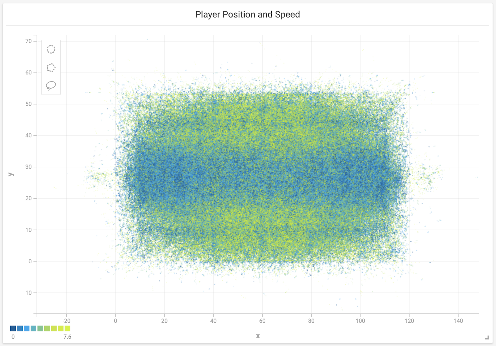
To create this visualization of the field with the players’ position, start by selecting the “Scatter” chart type at the top of the chart editor. Select the NFL data set as the Source, on the left at the top. Under that, for the measures, set the X Axis to the “x” column and the Y Axis to the “y” column in your table. That will show a representation of the field, with all of the player positions. Next, for the color measure, I suggest selecting the “s” column from your data, which represents the speed of the player at that point. This will help us visualize how fast the players are going at each step of the play.
When you make this change, you see the color of the scatter plot change, with more yellow on the outside of the field where the faster wide receivers tend to be. Two more optional things you might want to do to this chart before you hit the blue Apply button in the upper right side of the page: give the chart a more readable title by clicking on the title at the top, and add the “displayName” and “PositionAbbr” details to the Popup Box setting on the right side (this will make it so you can see who the players are when you hover over them). Click Apply, go back to the dashboard, and resize the chart so you can see the whole field more easily. (Don’t forget to save the dashboard now that you have a chart worth saving!)
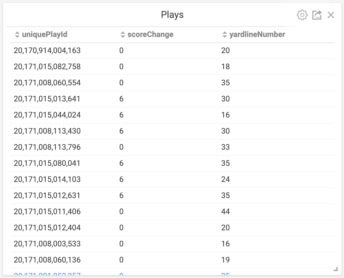
The second chart we’ll add is a simple table, showing each of the plays across all of the games. To add this chart, click on the Add Chart button from the dashboard, and then click on the Table chart type at the top. The table containing your NFL data should already be selected as the Source, because it is already being used in the dashboard. Next, click Add Dimension and select the “uniquePlayId” dimension from your table. By default it starts as a binned dimension, but we want to see each of the plays, so uncheck the Binning On checkbox and you’ll see the table switch to showing each of the plays.
To add the score change of each play as the second column, we’ll need to add a custom column that calculates the score change from the data. First click Add Dimension again, and this time click on the Custom SQL Dimension option at the top of the list. From here, you can add your own custom SQL to calculate the score change by pasting this as the SQL expression: “(HomeScoreAfterPlay - HomeScoreBeforePlay) + (VisitorScoreAfterPlay - VisitorScoreBeforePlay)”. Finally, you can also add the “yardlineNumber” dimension as another column in the table chart to see where the play started. Hit the Apply button and you’ll be back at your dashboard with the two charts.
With these two charts, you can now click on individual plays (or multiple plays) in the table chart and see the movements of the players in the scatter plot chart. You can see how fast players were moving during the play by the color (for the default colors: yellow is fast and blue is slow), and roll over the lines to see who the individual players are in the play (assuming you added the information to the Popup Box setting in the scatter plot chart). Your dashboard should look something like this:
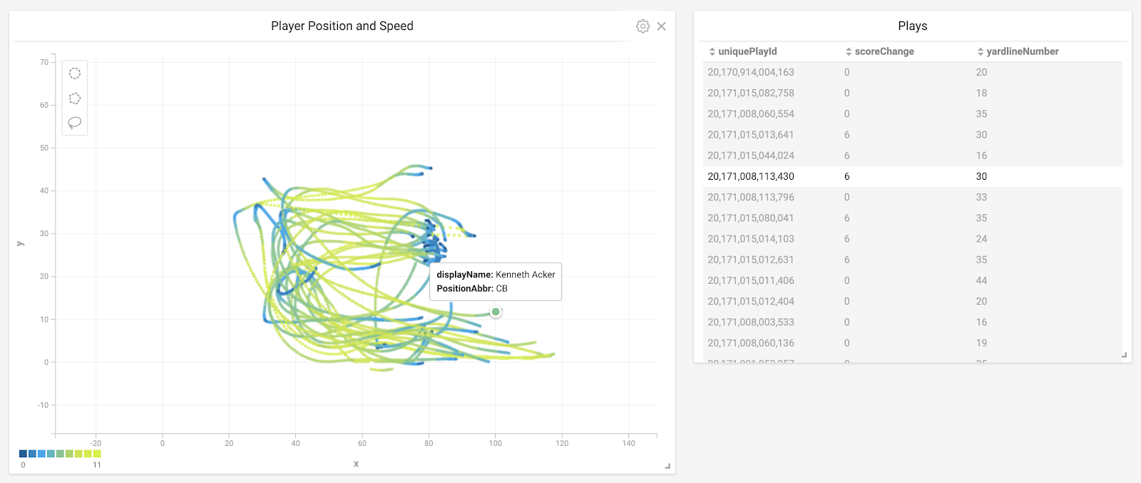
This cross-filtering capability (where one chart updates automatically when a filter is applied in the other chart) is why we flattened the tables earlier in the exercise, because the cross-filtering feature only works on data from a single table.
Looking at a More Complex Dashboard
This is a more complex dashboard, showing more of what’s possible with the NFL data. Play the video to see a walkthrough of the features.
What’s Next?
With this introductory analysis of the data, we’ve only scratched the surface of what’s possible. We could add some additional data and build additional dashboards to help answer deeper questions. For instance:
- If we turned the individual points of each player’s movements into linestrings, we could also measure additional attributes like distance traveled.
- With those lines we could also programmatically compare the routes each player ran to an ideal version of the route, looking to see how players route running changes during a game and between opponents.
- We could also normalize all of the plays to a common line of scrimmage and visualize the routes and patterns from that line. This would give us a better method to compare the route-running of a single player between plays and positions, and between players from different teams.
I hope this is not the last time the NFL hosts the Big Data Bowl, and next time I hope they give us at least one full season of data. With OmniSci, even tens of billions of player telemetry points would not be any problem. Based on the results of this competition, hopefully other sports leagues will step up and offer data as well for similar competitions. Especially for sports like hockey or soccer, where the action is not broken into plays, it would be fun to analyze the action.
