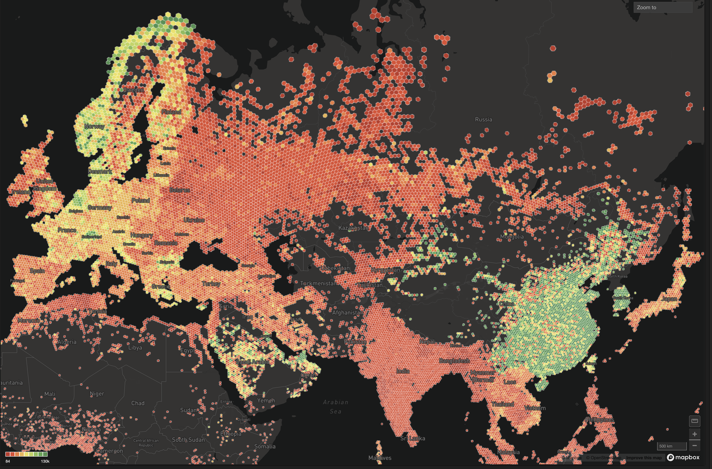
Release feature focus: Lassoing data insights with the lasso tool
Try HeavyIQ Conversational Analytics on 400 million tweets
Download HEAVY.AI Free, a full-featured version available for use at no cost.
GET FREE LICENSEWe felt it wasn’t fair that only features in our major releases were getting the limelight, so this will be the first in a series of short blog posts featuring an interesting feature or improvement in our regular minor releases of MapD’s GPU-accelerated Core database and Immerse visualization software.
This week, we celebrate the addition to Immerse of a tool known to cowboys and data analysts across the land: the lasso tool. Named after the looped rope which tamed the West, the lasso tool allows you to draw a circle (or other shape) around a region of interest, to isolate for data in that region.
The gif animation below shows how it looks in practice on our US Political Contributions demo dataset. First we use the lasso to hone in on the Upper West Side of Manhattan, where we can see via the pie chart that Democratic politicians and PACs receive roughly 75% of donations. Moving to the Upper East Side, we see significantly more Republican donations. Finally, moving down to Battery Park near the headquarters of Goldman Sachs, looking at the “Donations by Recipient” bar chart we can see the donating power of Goldman’s corporate PAC at the top.

You can see the lasso tool provides a nice way of quickly exploring trends within a map window without having to pan or zoom the viewport.
From a technical perspective, this was implemented using Mapbox’s draw tool with some slight enhancements. Drawn circles generate simple SQL, while for drawn polygons we've used Earcut.js to break the polygons into constituent triangles that are included in the SQL sent to our MapD Core database. Depending on the shape drawn the queries can get complex, but the Core database excels for these types of queries, crunching through them up to 200x quicker than would be possible with a typical, non-GPU accelerated in-memory database.
A couple other items in this release worth a quick honorable mention:
- Our handy distance_in_meters function is now about 5x faster for floating point numbers, allowing for faster measuring of distance between sets of lat/lon.
- You can now create tables from Immerse using uploaded KML, geojson or shapefiles.
- Our heatmap chart now features a friendlier display for time and string data.
Full details available in our release notes.


