
Time-Series Forecasting with Facebook Prophet and OmniSci
Try HeavyIQ Conversational Analytics on 400 million tweets
Download HEAVY.AI Free, a full-featured version available for use at no cost.
GET FREE LICENSENOTE: OMNISCI IS NOW HEAVY.AI
Humans have always wanted to know what will happen next.
In this post, we’ll explore how you can use the open-source forecasting procedure Facebook Prophet, OmniSci, and a historic time-series dataset to give a view into the future.
The Data
Let’s take a look at the data we loaded into OmniSci before we delve into future predictions.
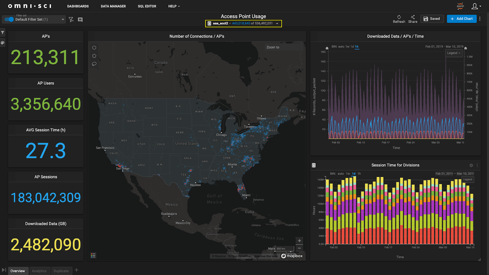
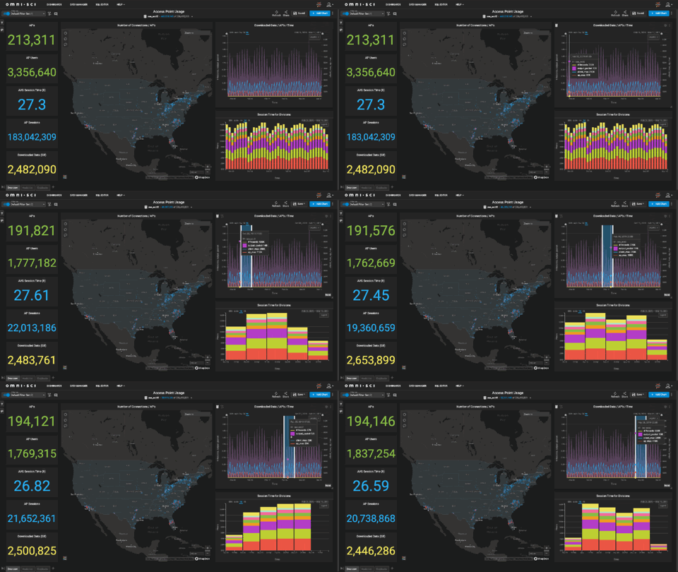
We have five weeks of wireless access point data that total 536M records. 443M of those records are currently visible in our map of the continental United States (note: If we were to zoom out to show Alaska, Hawaii, and Puerto Rico, we would see all 536M records).

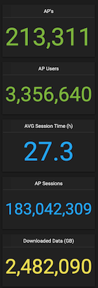
Looking at the left-hand side of the dashboard, we see some interesting metrics:
- 213K access points (APs)
- 3.3M users
- 27.3 average session hours
- 183M sessions recorded
- 2.4M GB of downloaded data
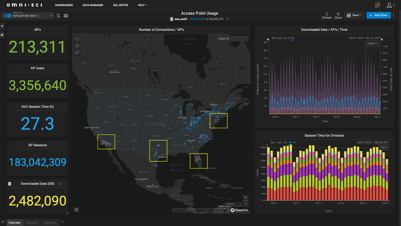
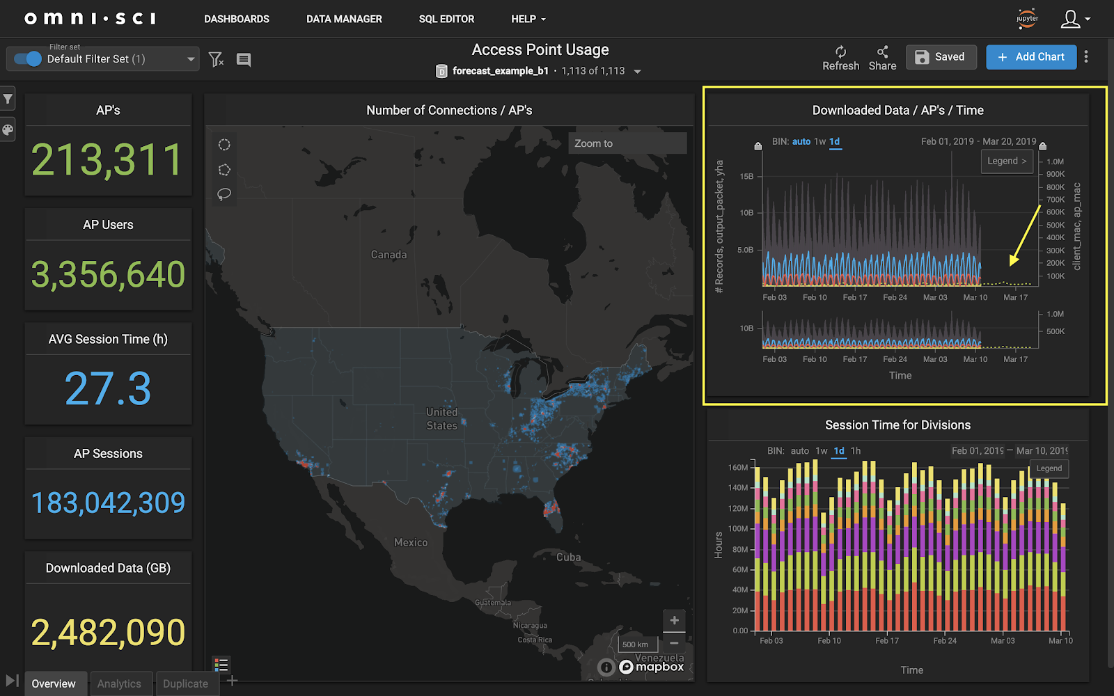
One of OmniSci’s most salient features is its ability to render large amounts of spatiotemporal data. The map below shows the location of active access points. We’ve highlighted several areas to emphasize concentrated pockets of access point connections. We’ll cross-filter all of the charts by focusing on one area of interest.
Let’s concentrate on Dallas by holding shift and drawing a box around the area of interest or by entering ‘Dallas’ in the search box to zoom in. Using one of the map selection tools (e.g., concentric ring, box, or freehand) enables even greater control over which records we'd like to explore.

The bottom right-hand corner chart shows a breakdown of the corporate divisions and how much access point session time they consume daily.

The chart in the top right corner of the dashboard highlights the core of this post.
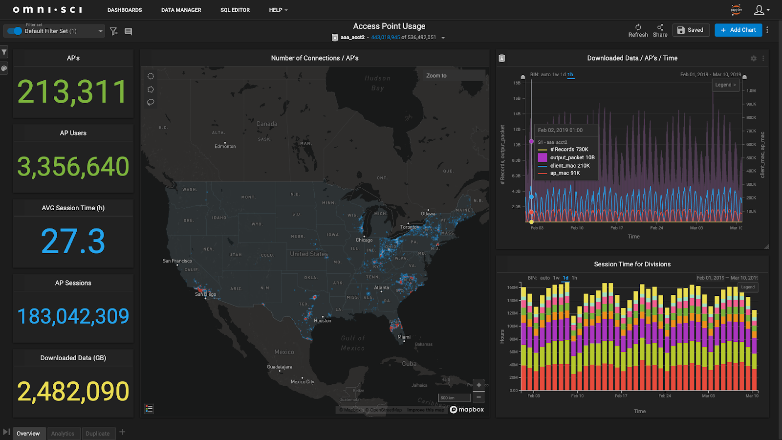
This chart presents several key data points over five weeks:
- Number of records
- Amount of data transmitted
- Number of clients connected to an access point
- The number of access points reporting data at a given point in time
What if, from this data, we could determine how an access point is going to behave in the future? The rest of this post will focus on that question.
OmniSci and Jupyter - Better together
Thus far, we've used OmniSci’s interactive visual analytics tool, Immerse, to explore our datasets. Now we’ll look at OmniSci’s data science foundation and see how we can extend our analysis’s reach.
OmniSci integrates with JupyterLab and enables data scientists to switch from exploration to experimentation with a single click. The integration is a multi-user notebook environment preloaded with purposeful open source libraries and utilities that work seamlessly with OmniSci.
Clicking the Jupyter button in Immerse’s top right corner launches the Jupyter environment.
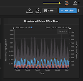
After clicking the Jupyter button, OmniSci will present you with a notebook that contains a connection to OmniSciDB.
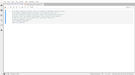
We’ll confirm that we can connect to OmniSciDB by running the following:
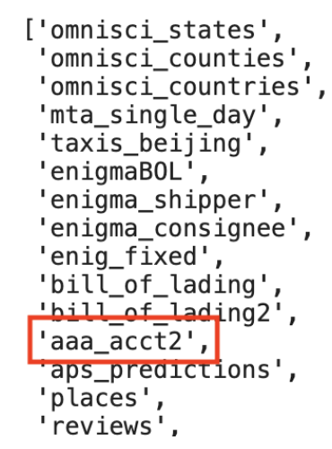
This snippet confirms the connection and returns a list of the tables in the database. We’ll use the same aaa_acct2 table from the Immerse dashboard to continue the workflow.
Next, we’ll load the requisite libraries:
In addition to FaceBook Prophet, we’ll use:
- Pymapd - provides a client interface to work with OmniSciDB and methods to return results in Apache Arrow-based CUDF GPU dataframe format for efficient data interchange.
- Ibis - allows a user to interact directly with OmniSciDB by writing high-level .py code instead of SQL.
- Pandas - gives the ability to take data and create a Python object called a dataframe that acts as a high-level building block for doing analysis using Python.
We’ll make a connection to the aaa_acct2 table now that we’ve loaded the libraries:
Let’s see how many rows are in the aaa_acct2 table:
The print statement returns 536,492,051 rows of data. Is that correct? We can validate that figure by returning our Immerse dashboard.

The aaa_acct2 table contains a few different account types, of which we only want to examine types 1 and 2. Let’s filter out the unwanted account types with the following:
The print statement returns 425,644,001 records with an account type of 1 or 2. We’ll validate that figure using Immerse’s SQL editor.
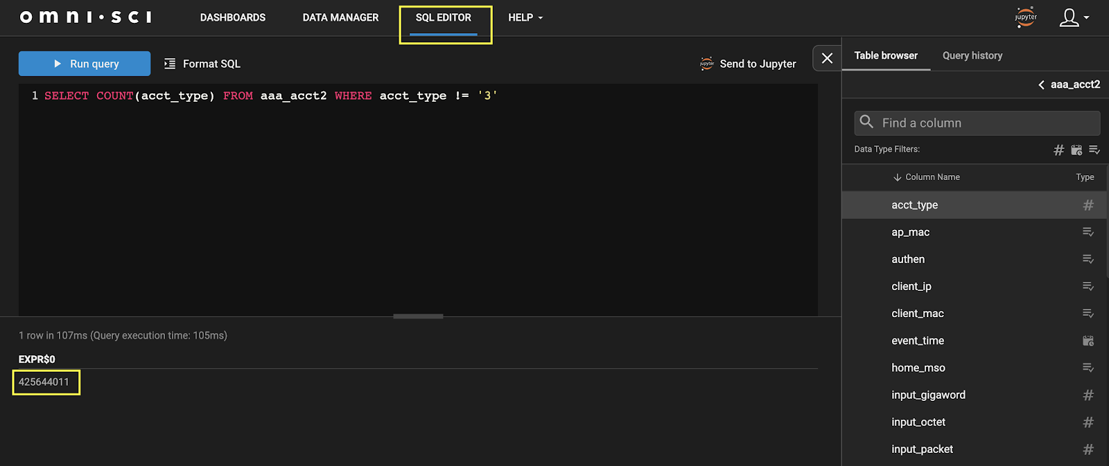
Next, we’ll identify which access points are active and only work with them.
We are dealing with 5+ weeks of data and need to extract the correct date range to complete the analysis.
The print statement returns data from the 1st of Feb through the 10th of March.
(Timestamp('2019-02-01 00:00:00'), Timestamp('2019-03-10 23:59:59'))
Next, we’ll remove non-existent mac addresses by filtering out the 00:00* addresses.
Let’s select a mac address to work with and determine its behavior over the past 30 days.
We’ll use the following to understand the y-value of the access point we selected:
Now we’ll build a forecast for a connection profile of the selected access point:
Executing the snippet above delivers a plot of the data. The darker dots represent outliers, while the blue line represents the selected access point’s forecasted usage projection.
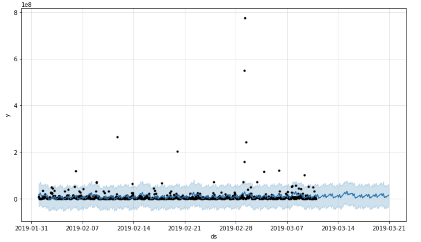
The forecast analysis is complete. We’ll visualize the output back in Immerse by creating a new table in OmniSciDB with the analysis results.
The new table is now visible in Immerse’s Data Manager. We can quickly find the table and view its column headers and data types.
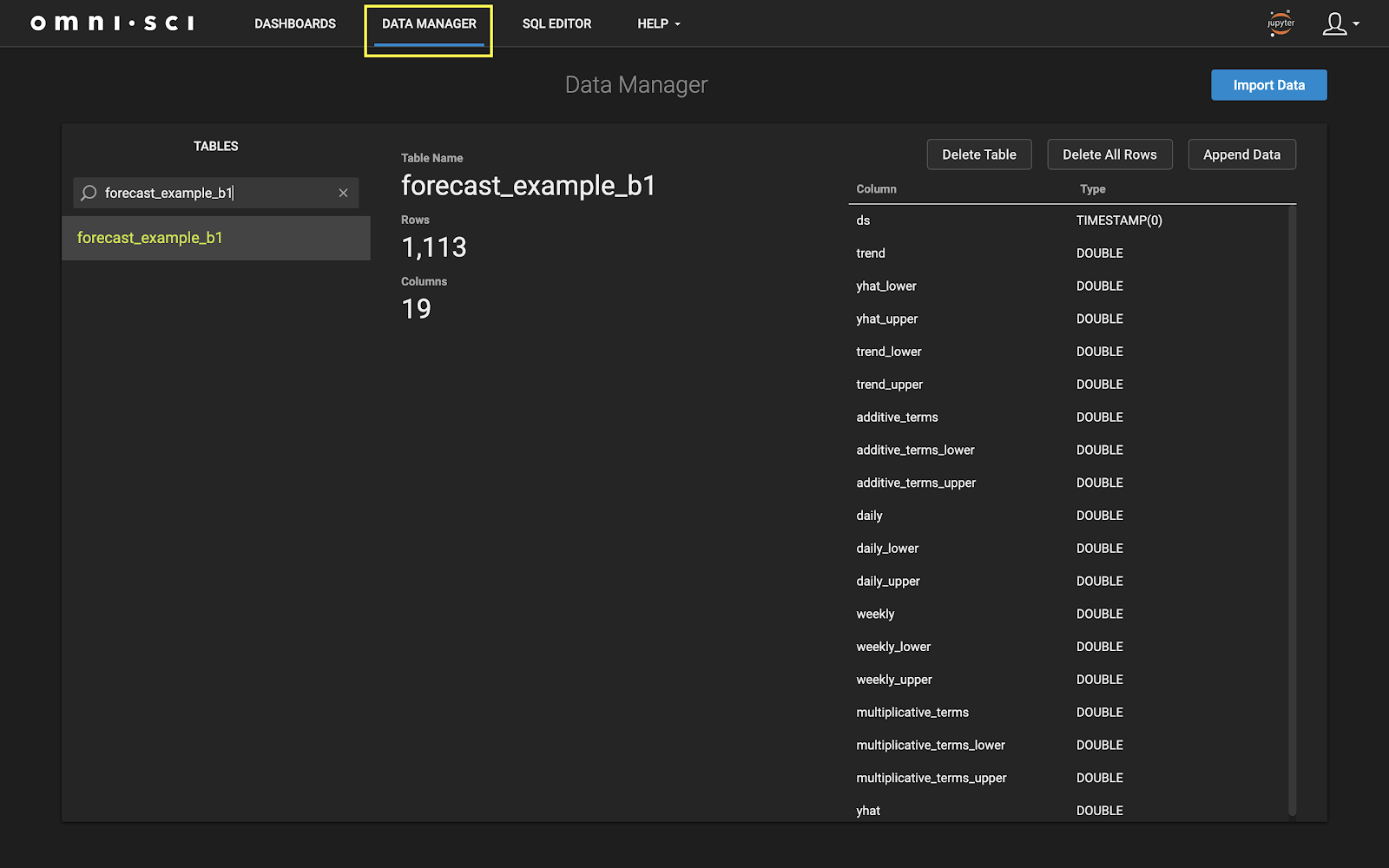
We mentioned earlier that we were going to focus on one particular chart in our dashboard.

To review, this chart shows:
- Number of records
- Amount of data transmitted
- Number of clients connected to an access point
- The number of access points reporting data at a given point in time
Keep in mind that the chart is showing data for all the access points in our dataset. How will the chart look if we plot the values from the table that we just created?
If we open the chart in edit mode, we can see all the individual controls available to a combo chart, including adding another dataset.
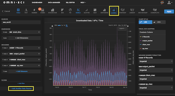
We use the following parameters:
- Source = forecast_example_b1
- X-axis = DS (time)
- Y-axis = yhat (forecast value)

After clicking Apply, we see the updated chart in the dashboard.
Conclusion
You can also build out simple forecast models that forecast your data into the future based on OmniSci and our data science foundation. Try for yourself today, get started with OmniSci.


